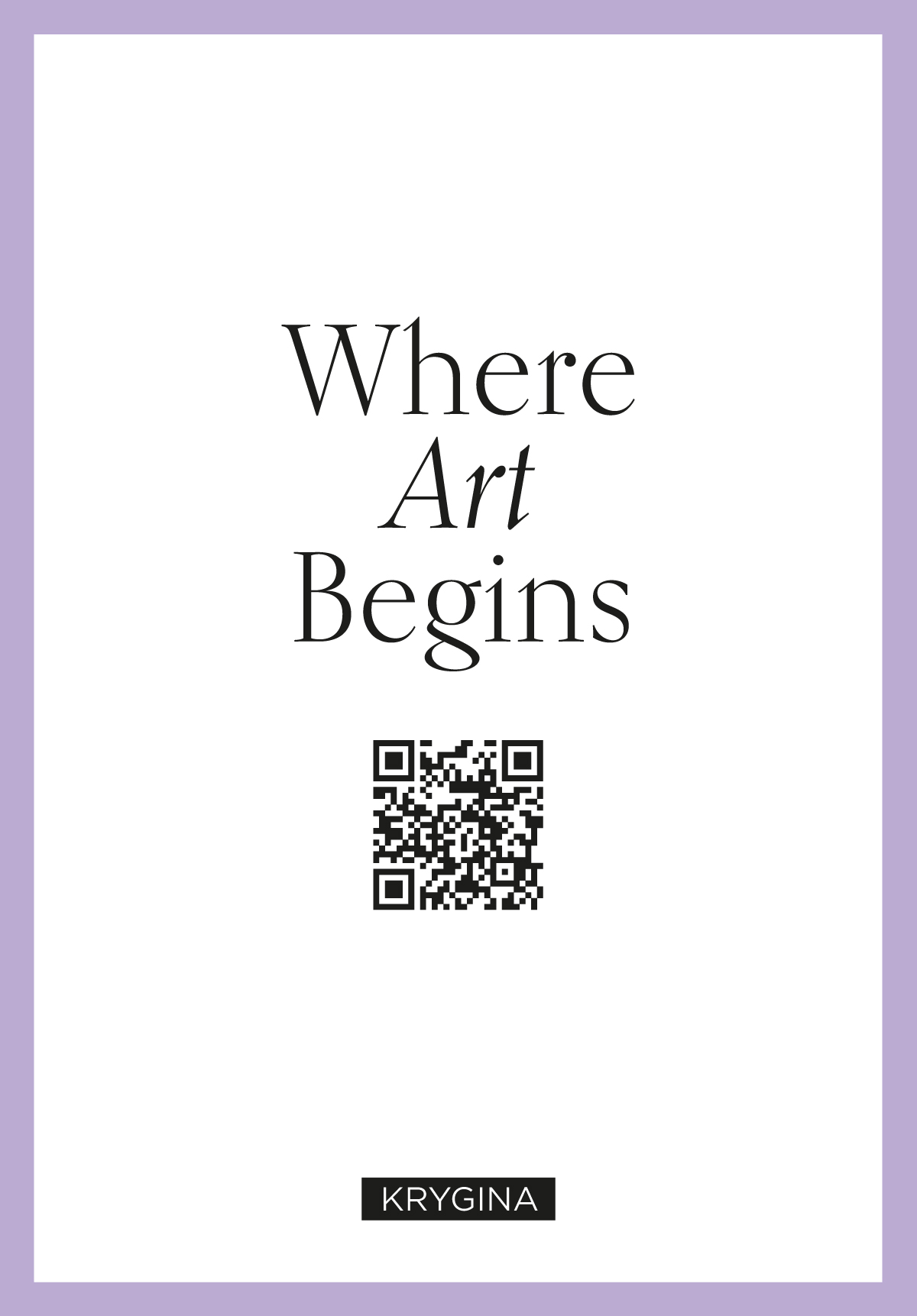
Krygina Box Vol.1
Campaign
The Krygina Box project is renowned as Russia's first and most popular Cosmetic Sample Kit. Over the course of 5 years the service was distinguished by its packaging, which incorporated scrapbooking elements, intricate designs, and references to postal themes. As the demand grew, we faced the challenge of streamlining the manufacturing process, reducing delivery times for components, and minimizing packaging time while preserving its visually captivating and memorable appearance. To address these challenges, we made the decision to focus on print design. Here are some examples of Boxes with the updated design concept. They were released between 2019 and 2020.
Each box release involved meticulous development of the outer packaging design. Each time there was also a leaflet featuring a description of all the products enclosed in the box, and two stamp-shaped stickers with thematic brand illustrations that were affixed to the inner packaging. Additionally, we organized photo shoots to create content for social media and our online store.
Luxe
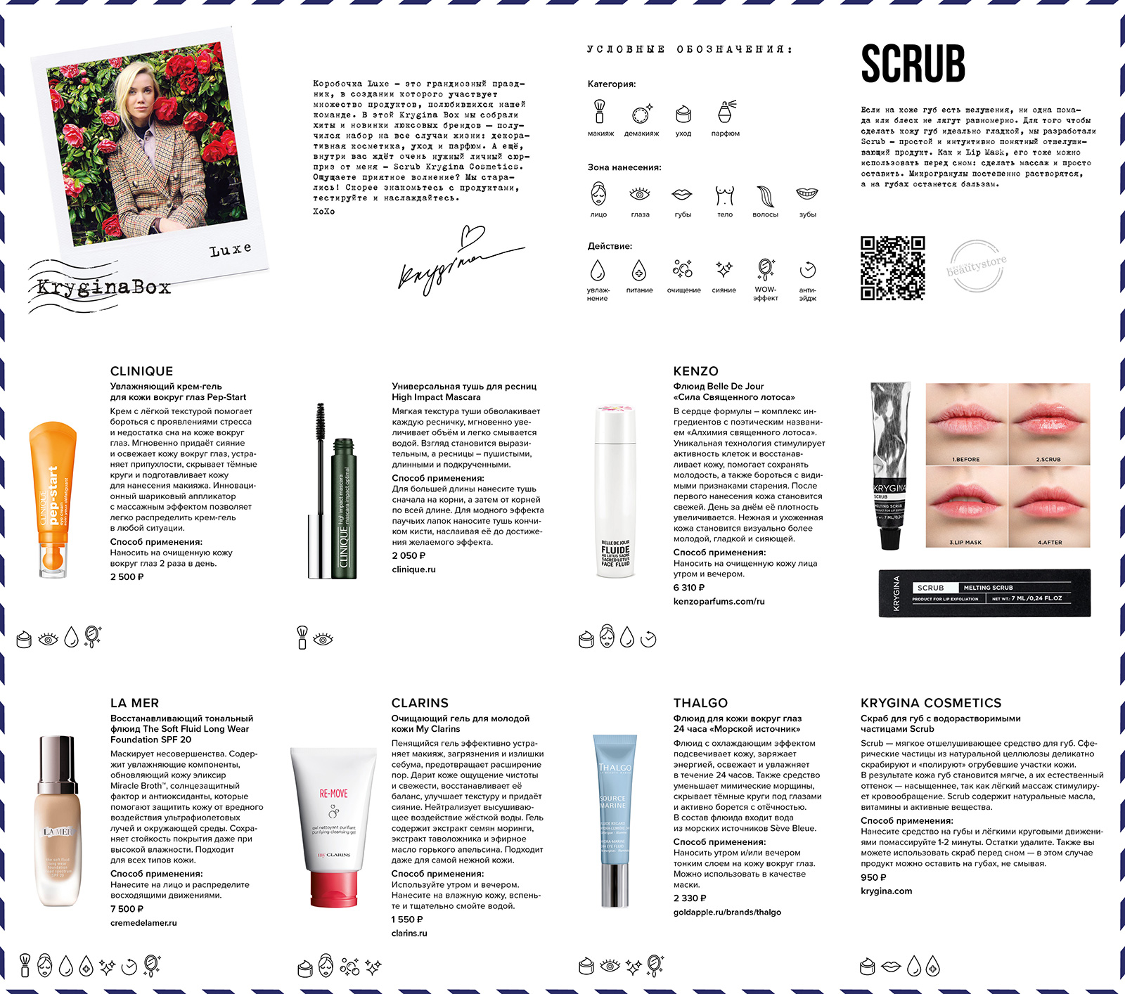
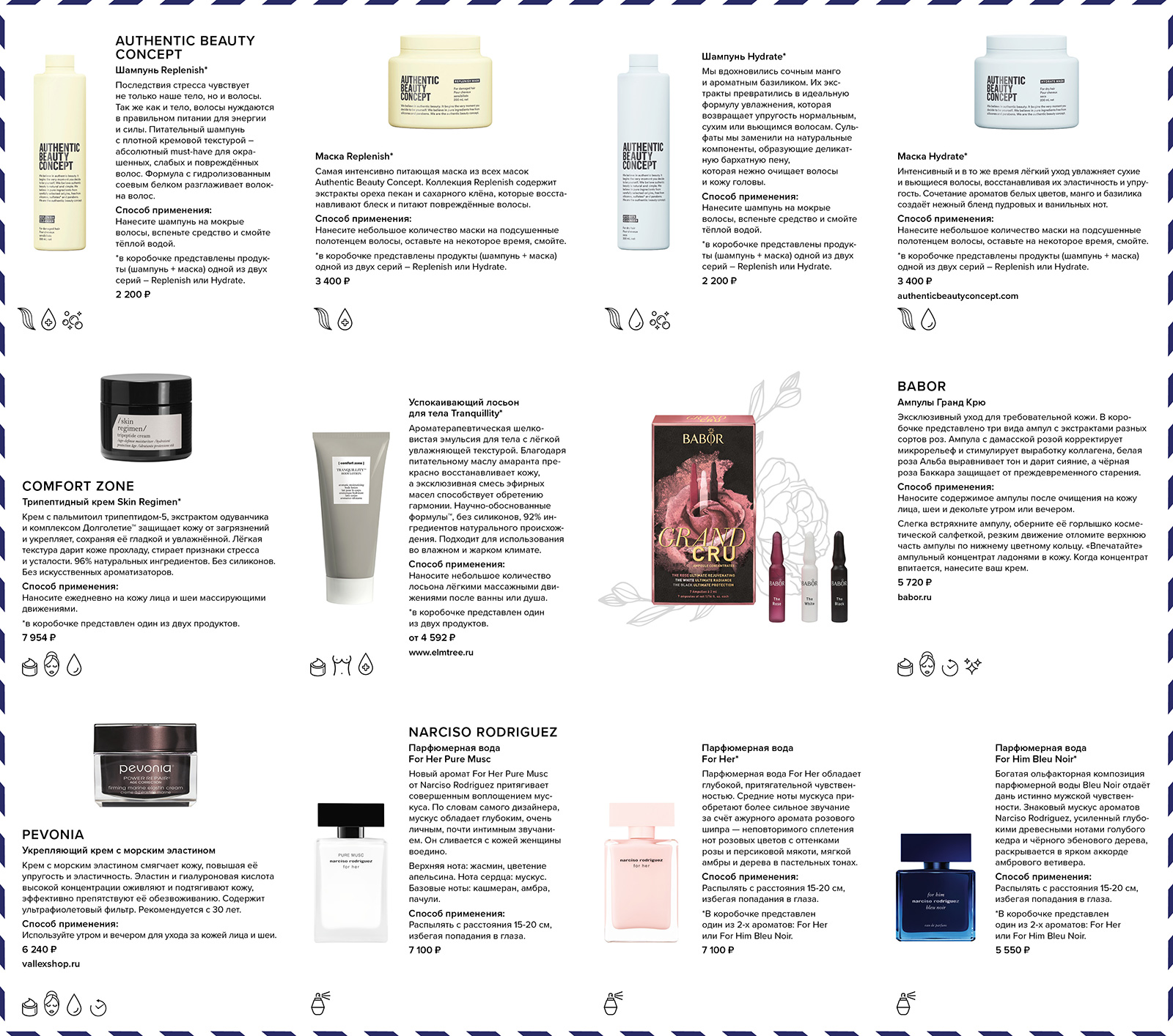
Krygina Box Luxe featured high-end cosmetic products by luxury cosmetic brands. To highlight its opulence, we've created a package in the shape of a gold ingot using dense metallized cardboard. A design resembling gold bars was embossed on the surface with blind the embossing technique.

Krygina Box Luxe featured high-end cosmetic products by luxury cosmetic brands. To highlight its opulence, we've created a package in the shape of a gold ingot using dense metallized cardboard. A design resembling gold bars was embossed on the surface with blind the embossing technique.

photos for social media
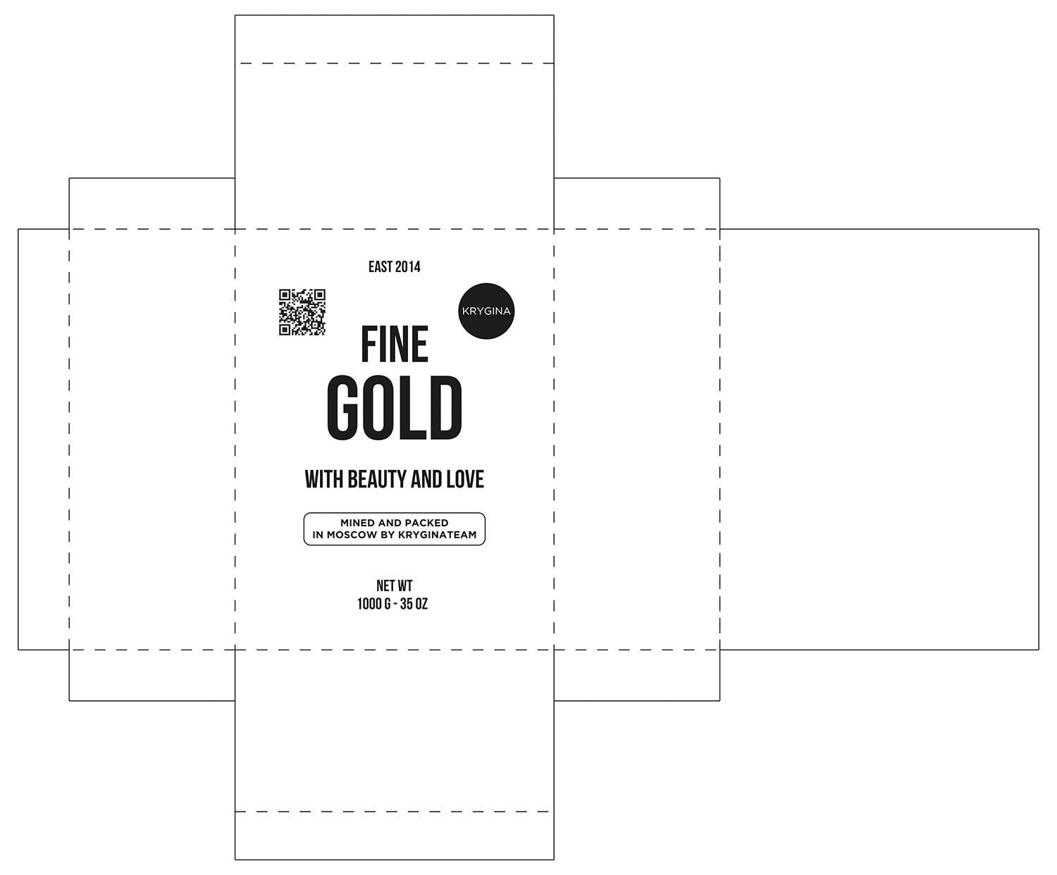
packaging layout
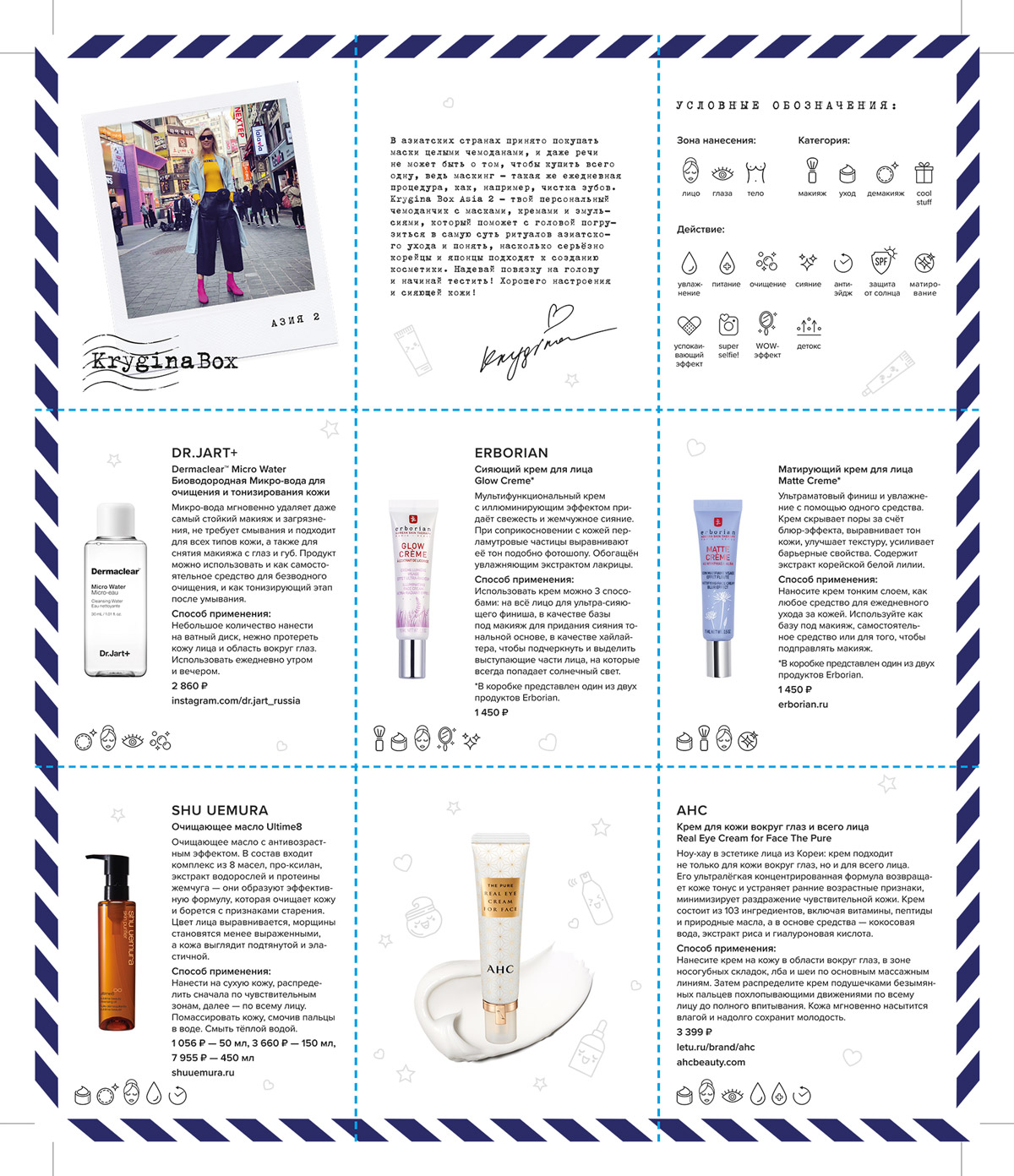
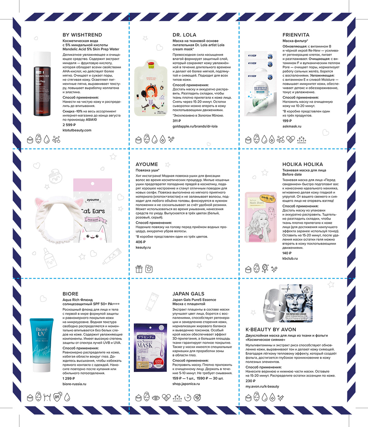
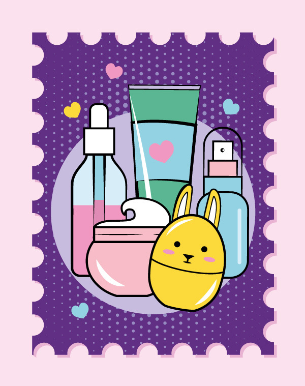
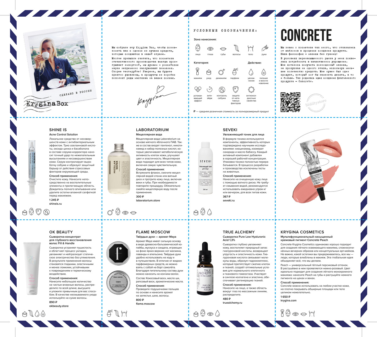
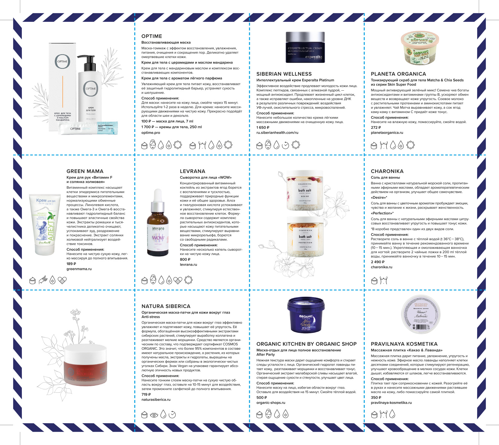
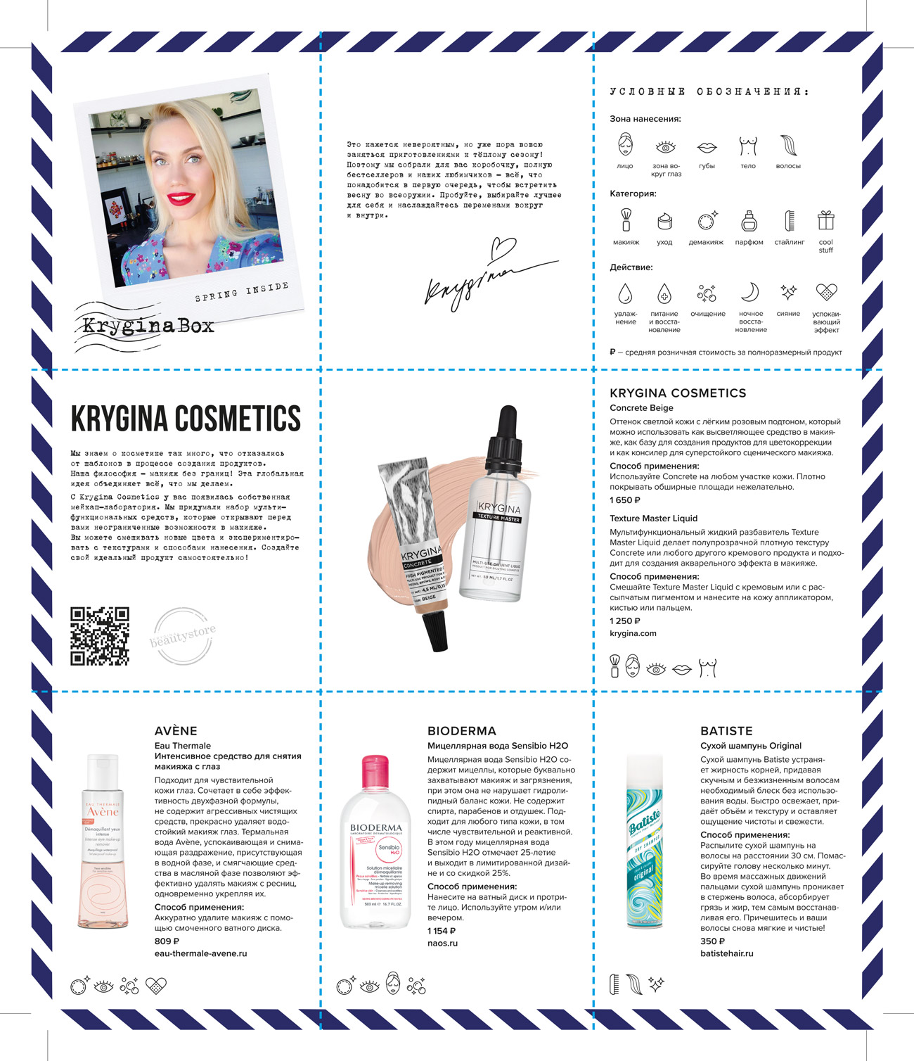
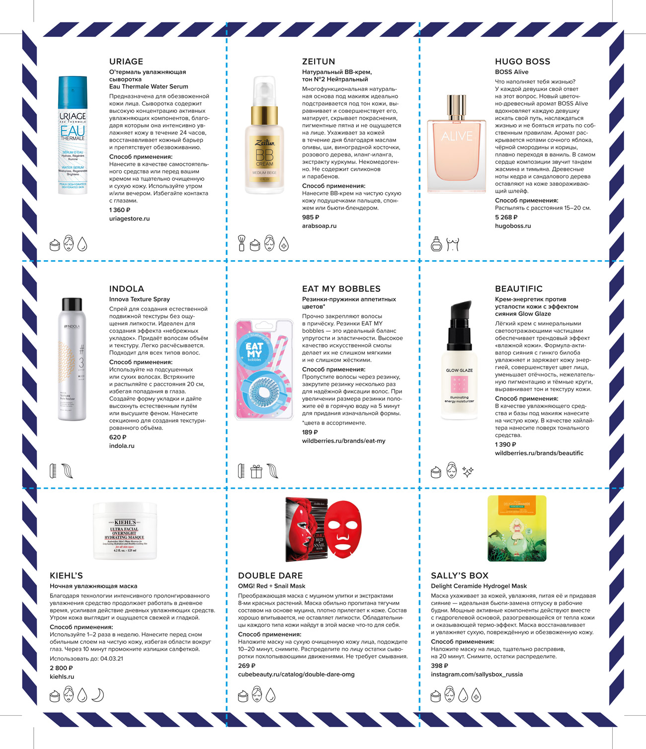
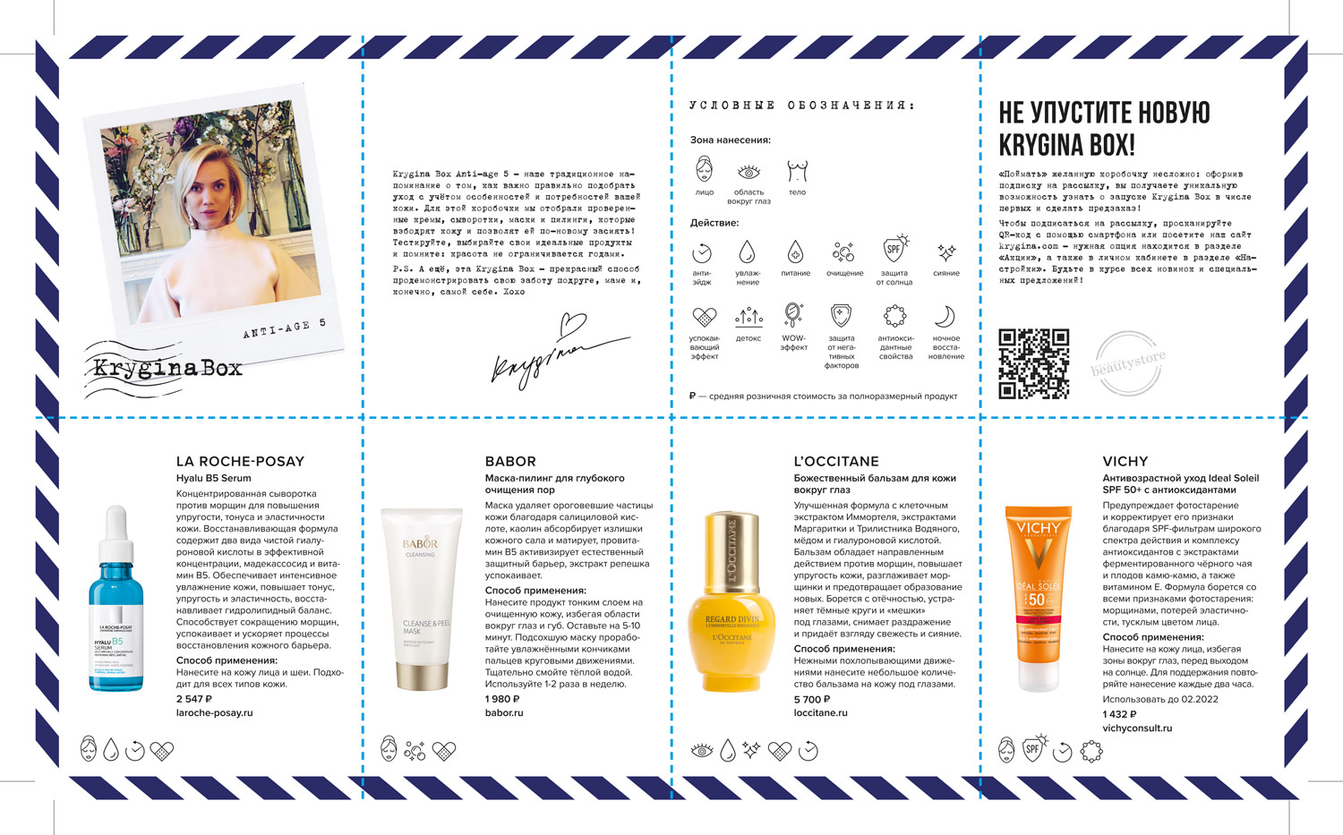
products and brands description card
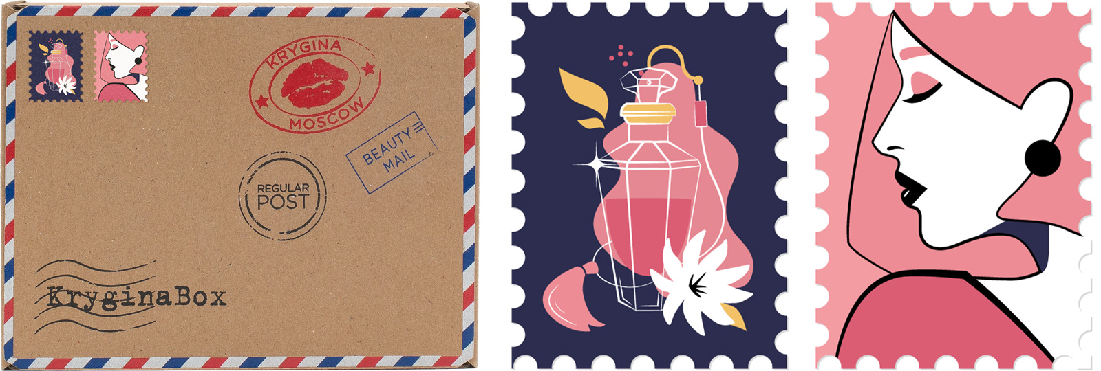
sticker-stamps and the inner packaging
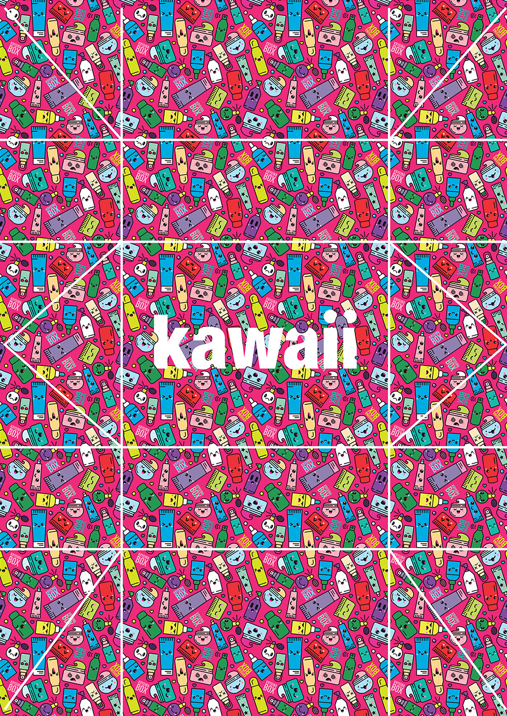
Kawaii
Krygina Box Kawaii is a collection of cosmetic products from Asian brands. The design features a charming pattern with cosmetic products with cute kaomoji (Japanese emoticons). In the center, we added the box name printed with a holographic effect.
For the photo shoot, we selected a pink background, complemented by holographic films and the adorable characters of Korea Cocoa and Sonny Angel.
For the photo shoot, we selected a pink background, complemented by holographic films and the adorable characters of Korea Cocoa and Sonny Angel.

Kawaii

Krygina Box Kawaii is a collection of cosmetic products from Asian brands. The design features a charming pattern with cosmetic products with cute kaomoji (Japanese emoticons). In the center, we added the box name printed with a holographic effect.
For the photo shoot, we selected a pink background, complemented by holographic films and the adorable characters of Korea Cocoa and Sonny Angel.
For the photo shoot, we selected a pink background, complemented by holographic films and the adorable characters of Korea Cocoa and Sonny Angel.
photos for social media
packaging layout
products and brands description card
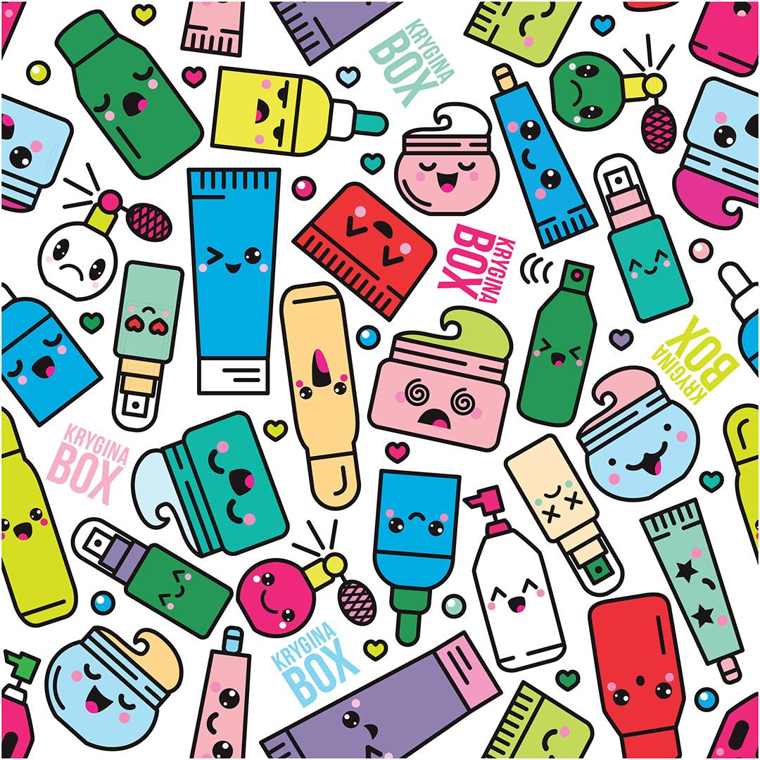
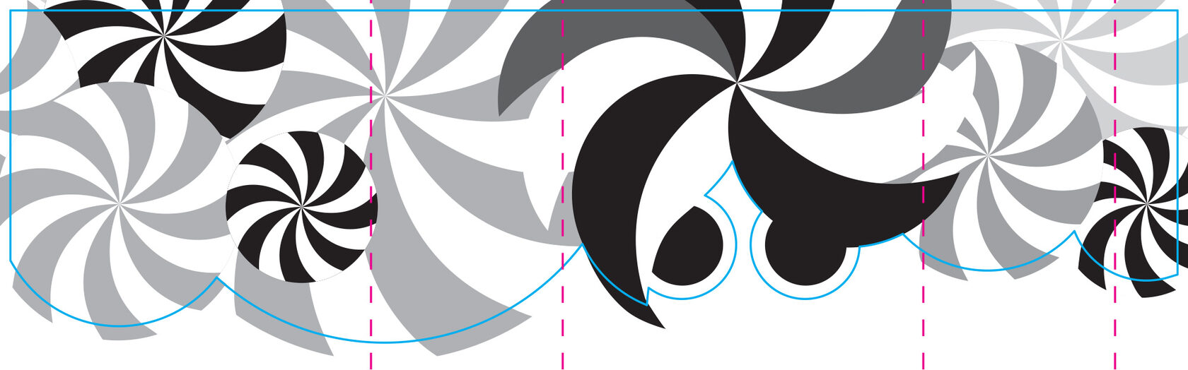
a pattern fragment
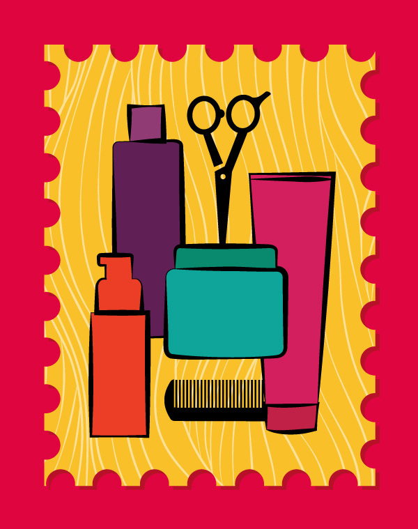
sticker-stamps
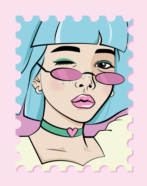
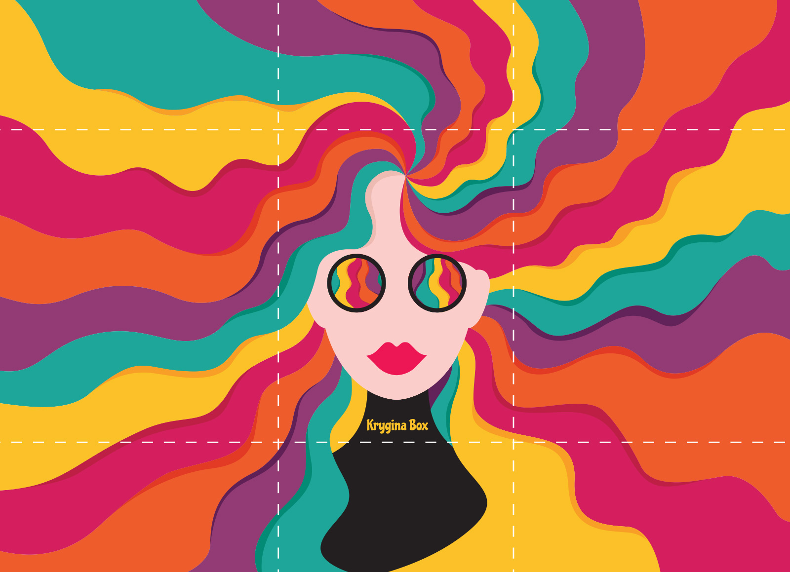
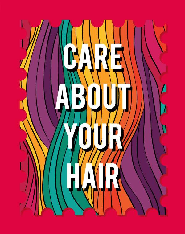
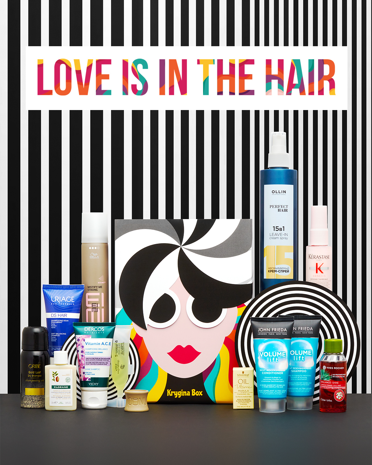
Love Is In The Hair
Krygina Box Love Is In The Hair is designed like a kind of a playful puzzle. At first glance, it features a girl's head with a black and white hairstyle and dark glasses. But an unexpected twist awaits — lift off the top layer of the package, and you'll unveil a carefree rebel girl with lively, brightly colored curls.

Love Is In The Hair

Krygina Box Love Is In The Hair is designed like a kind of a playful puzzle. At first glance, it features a girl's head with a black and white hairstyle and dark glasses. But an unexpected twist awaits — lift off the top layer of the package, and you'll unveil a carefree rebel girl with lively, brightly colored curls.
photos for social media
click to see the backstage from the shooting
click to see the backstage from the shooting
illustrations and their interaction on the finished box
photos to launch sales in social networks
a layout of the upper part of the package
a layout of the bottom part of the package
sticker-stamps
Favorites
Krygina Box Favorites is a selection of the most popular products featured in the project throughout the year. To highlight their significance, we arranged them under the glow of theatrical spotlights, creating a sense of brilliance and reverence.
For the packaging, we opted for thick black paper with a pleasant matte texture, enhanced with a generous layer of transparent varnish. Not only did this special touch shimmer under the light, but it also provided a delightful tactile experience.
For the packaging, we opted for thick black paper with a pleasant matte texture, enhanced with a generous layer of transparent varnish. Not only did this special touch shimmer under the light, but it also provided a delightful tactile experience.

Favorites

Krygina Box Favorites is a selection of the most popular products featured in the project throughout the year. To highlight their significance, we arranged them under the glow of theatrical spotlights, creating a sense of brilliance and reverence.
For the packaging, we opted for thick black paper with a pleasant matte texture, enhanced with a generous layer of transparent varnish. Not only did this special touch shimmer under the light, but it also provided a delightful tactile experience.
For the packaging, we opted for thick black paper with a pleasant matte texture, enhanced with a generous layer of transparent varnish. Not only did this special touch shimmer under the light, but it also provided a delightful tactile experience.
photos for social media
Erborian
The Krygina Box is a collaboration with the Erborian brand, showcasing a selection of their popular hits and novelties. We adhered to the brand's color scheme and used key visuals from their new advertising campaign. For an original touch, we applied the design to a silver mirror surface that highlights the brand's identity elements and draws attention to the packaging itself.

photos for social media
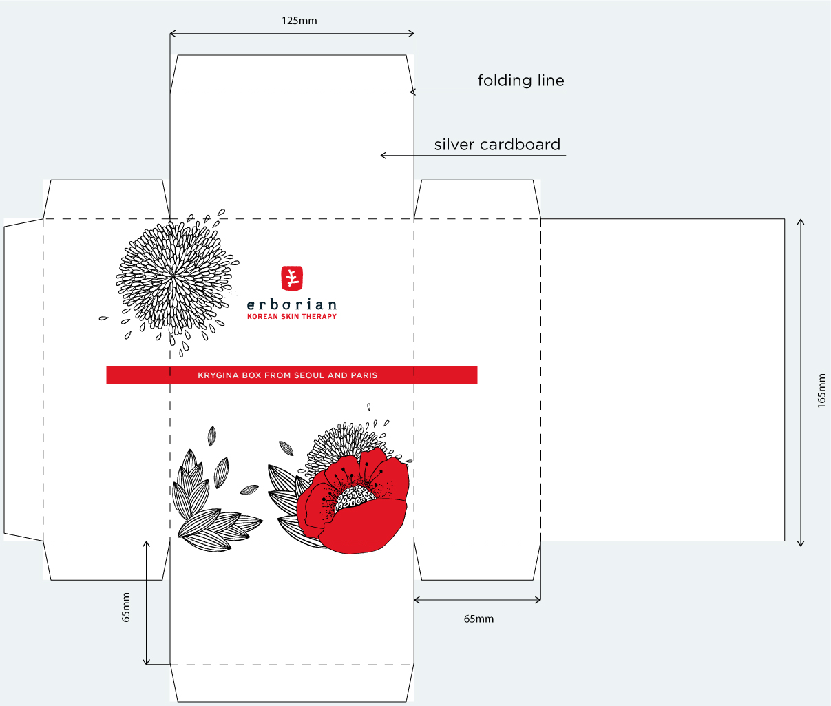
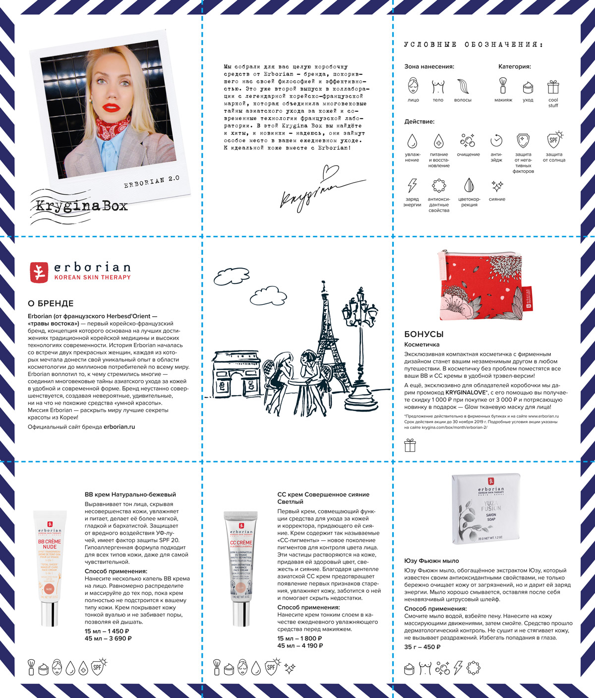
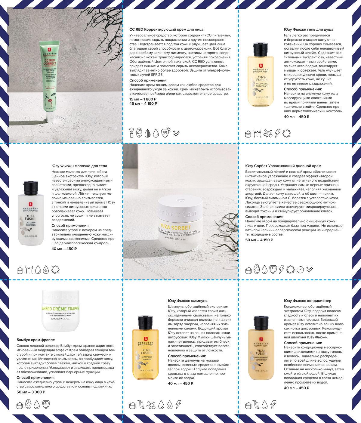
packaging layout
products and brands description card
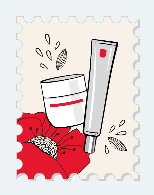
sticker-stamps
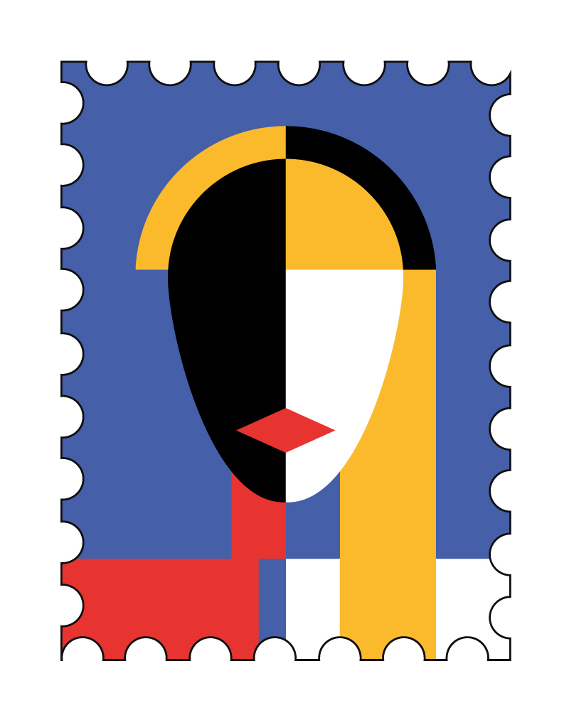
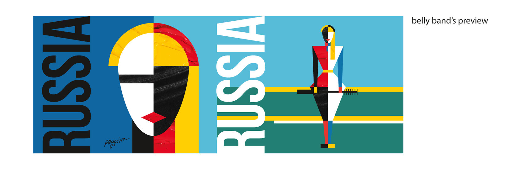
Russia
Krygina Box Russia was dedicated to the Russian cosmetic brands. Inspired by constructivism, we designed an outer "belly band" featuring an illustration reminiscent of Malevich's iconic style. The illustration showcases Elena Krygina, the brand's founder, with her signature red lips and mascara in hand.
We used both solid paint and images of cosmetic product textures in certain elements, while selectively applying varnish to create a tactile experience.
We used both solid paint and images of cosmetic product textures in certain elements, while selectively applying varnish to create a tactile experience.

content for social media
packaging layout
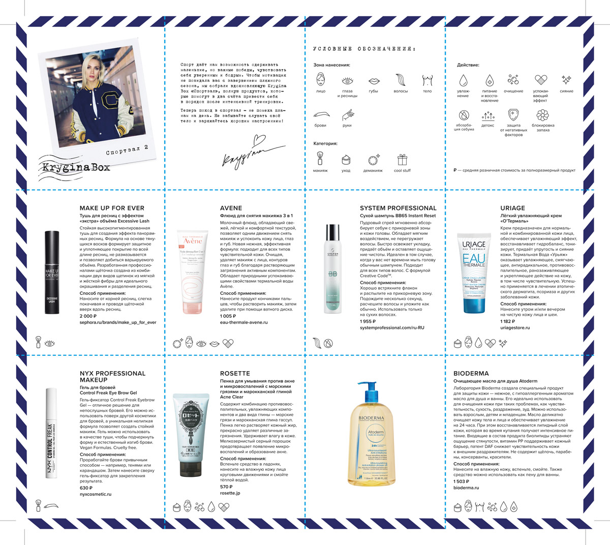
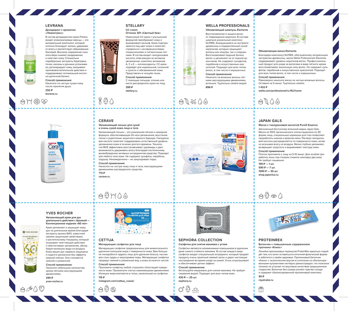
products and brands description card
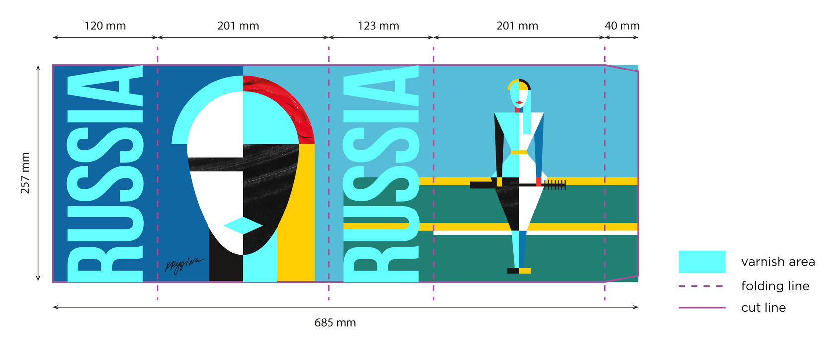
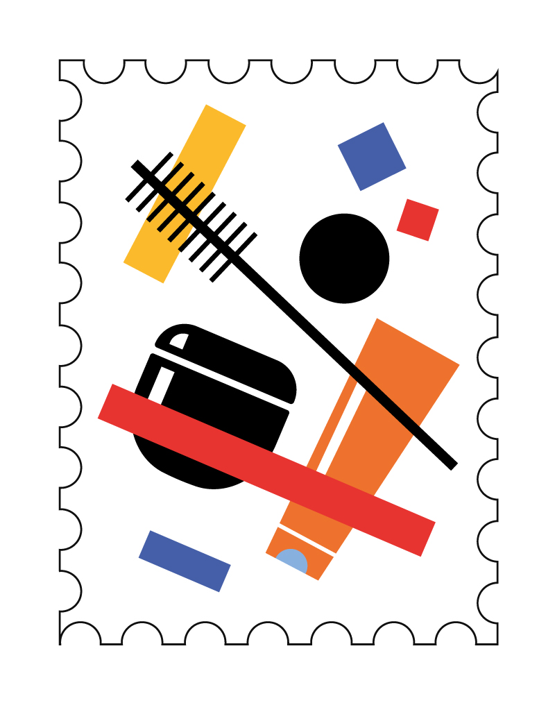
sticker-stamps
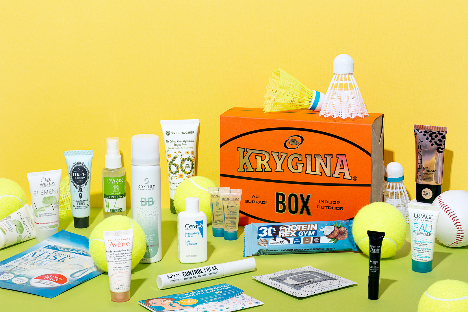
The Sport

Krygina Box The Sport featured products for convenient use at the gym. We found the idea of shaping it like a square basketball amusing. With the help of textured paper in the right color, we created a design with gold and black accents, drawing inspiration from basketball aesthetics. Additionally, we added elements with embossing and debossing to further enhance the resemblance. The result is a playful packaging that perfectly complements the sports theme.
photos for social media
products and brands description card
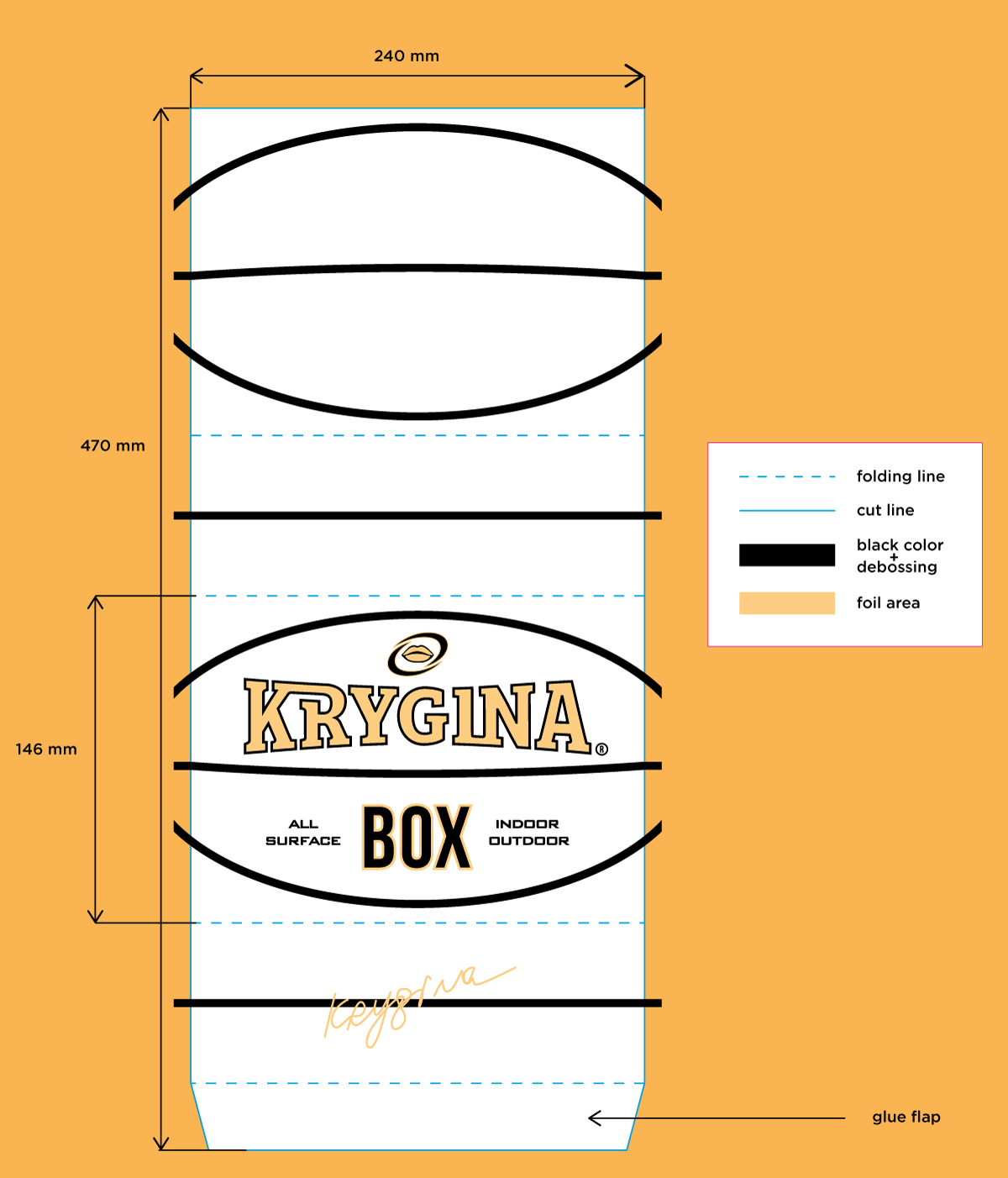
packaging layout
photos to launch sales in social networks
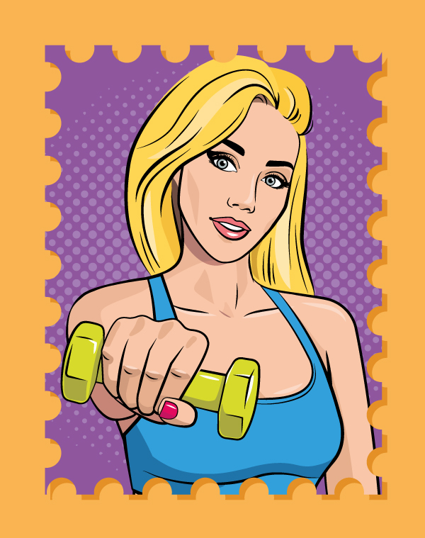
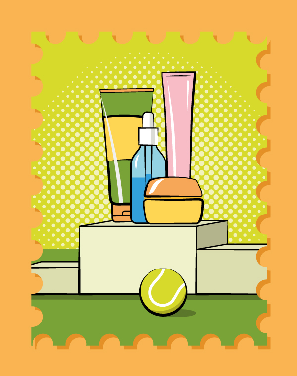
sticker-stamps
Spring Inside
This lavender box with a window featured best cosmetic products for the Spring season. We used some top-notch textured paper that feels amazing and threw in some elegant one-color typography, just to keep things chic. A central cutout adds a dash of intrigue, allowing you to glimpse just a part of the image. But inside, you'll discover a lovely card with a whimsical collage, echoing Krygina cosmetic signature style, along with an inspiring slogan.

Spring Inside

This lavender box with a window featured best cosmetic products for the Spring season. We used some top-notch textured paper that feels amazing and threw in some elegant one-color typography, just to keep things chic. A central cutout adds a dash of intrigue, allowing you to glimpse just a part of the image. But inside, you'll discover a lovely card with a whimsical collage, echoing Krygina cosmetic signature style, along with an inspiring slogan.
photos for social media
products and brands description card and photos to launch sales in social networks
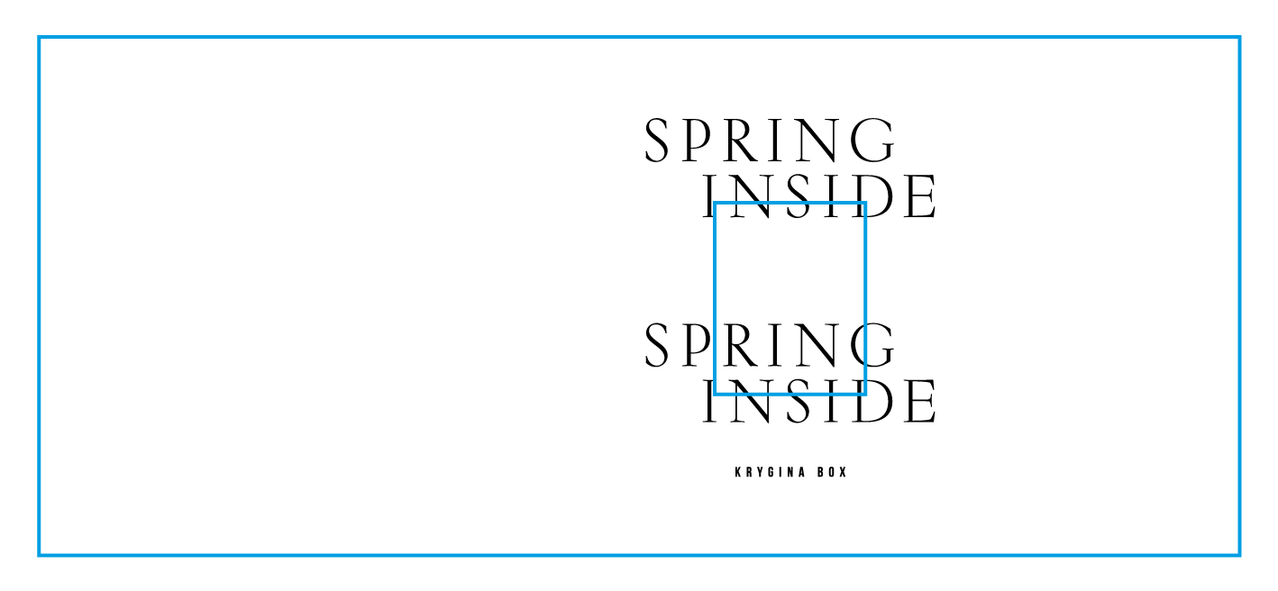
packaging layout
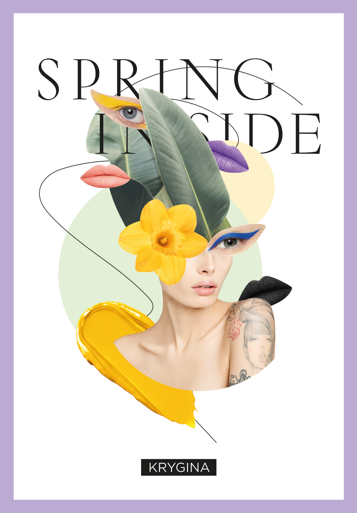
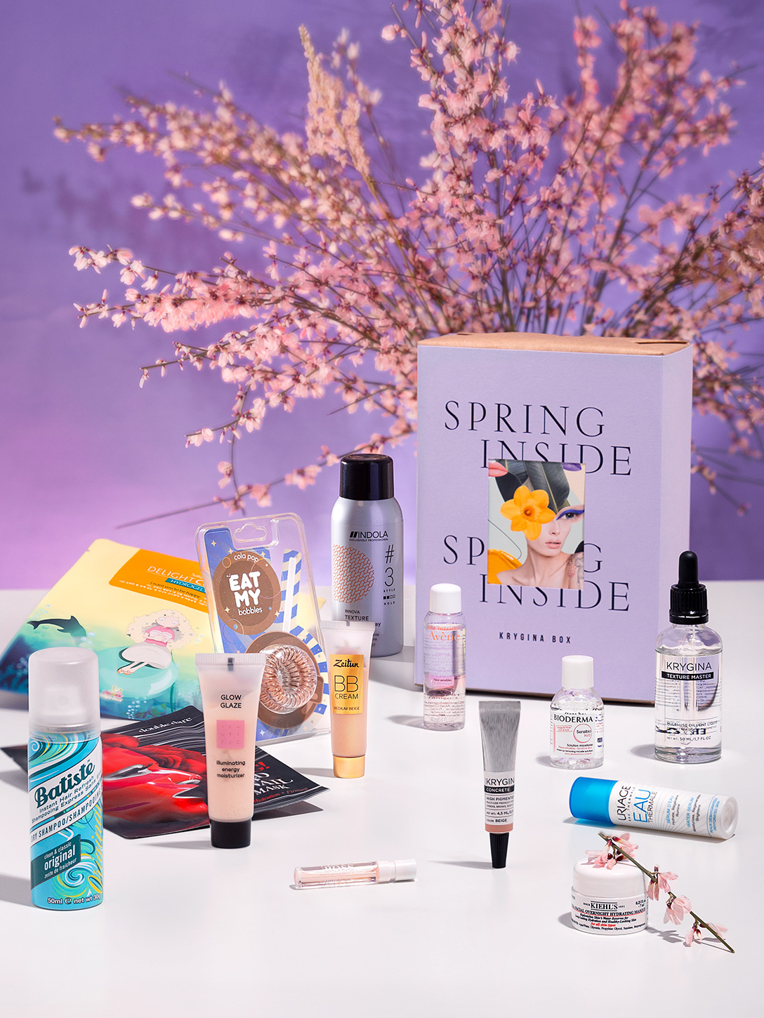
double-sided card — part of the inner layer of the package
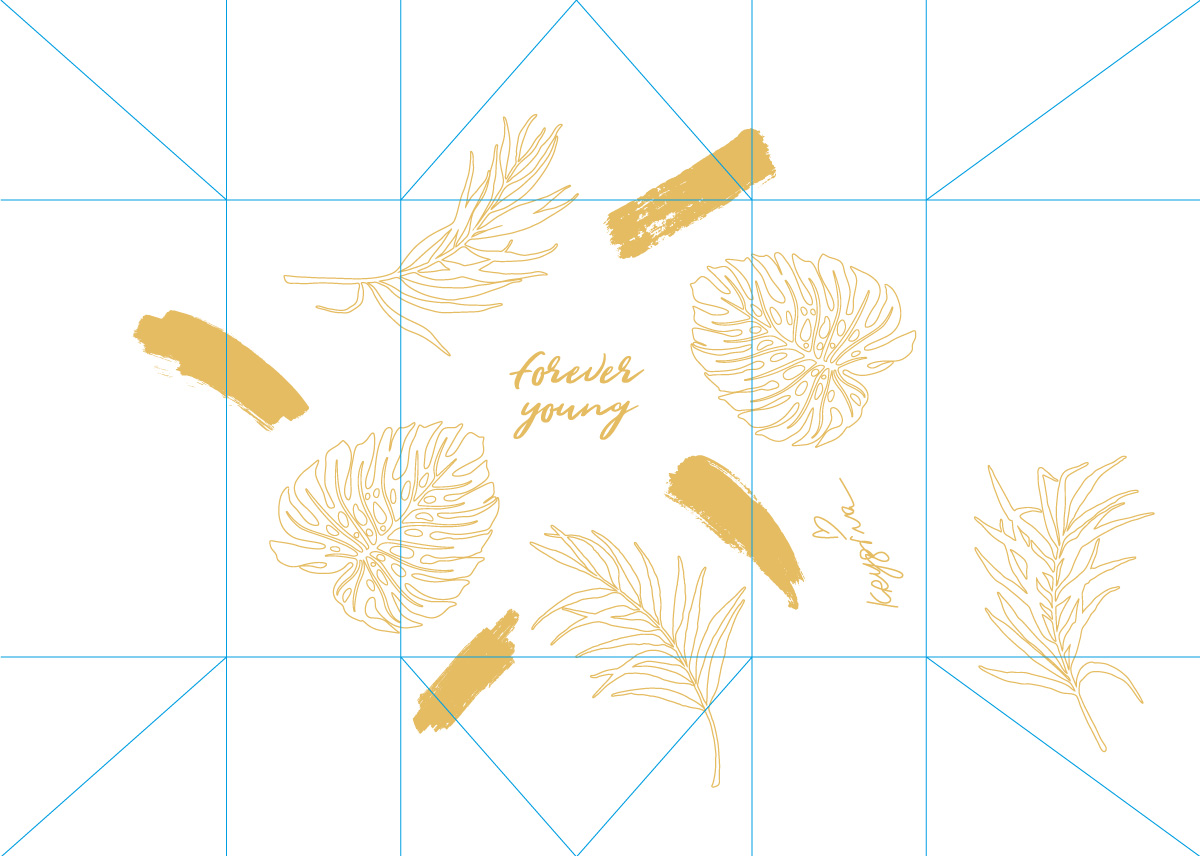
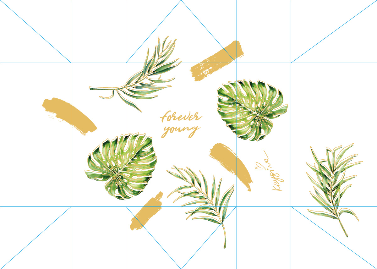
Forever Young
The Krygina Box Forever Young showcased products with anti-aging effects. We wanted to avoid a literal reading of the topic of age and create an elegant and refined packaging. We settled on a two-layer design. The bottom layer featured matte paper with printed images of plants. On the top layer we used translucent tracing paper with golden elements: the box name, texture strokes, and plant contours.

Forever Young

The Krygina Box Forever Young showcased products with anti-aging effects. We wanted to avoid a literal reading of the topic of age and create an elegant and refined packaging. We settled on a two-layer design. The bottom layer featured matte paper with printed images of plants. On the top layer we used translucent tracing paper with golden elements: the box name, texture strokes, and plant contours.
photos for social media
both layers together
paper with printed images
tracing paper with golden foil
products and brands description card
photos to launch sales in social networks
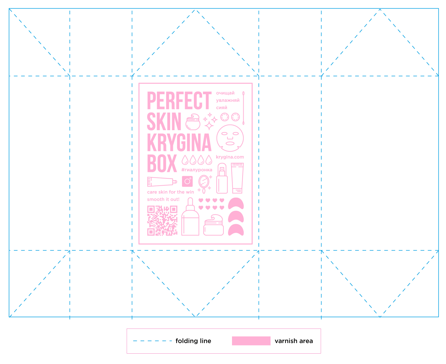
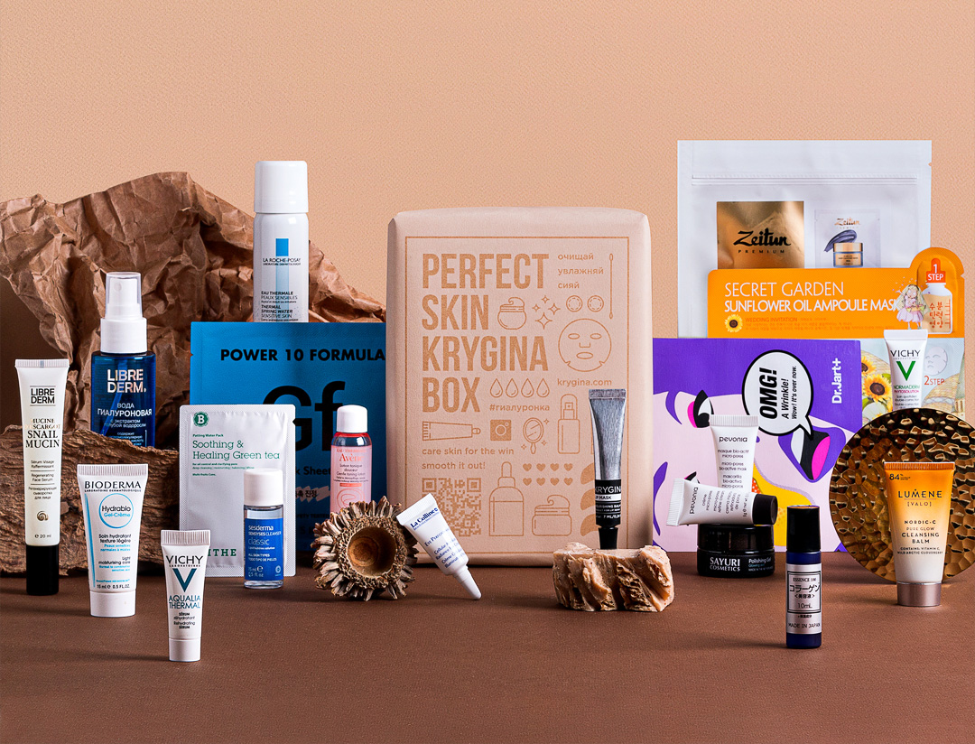
Perfect Skin
For the design of the Perfect Skin box we decided not to use any paint at all. We chose paper of the right color with a nice texture that's pleasant to the touch and applied our image on top with a thin layer of varnish. Due to the fact that the points where the varnish meets the paper have naturally darkened, the drawing is perfectly visible. Because of the difference in textures, we got a nice tactile effect. Beneath the image, the paper texture still shines through, which we have carefully preserved as the symbol the texture of perfect skin itself.

Perfect Skin

For the design of the Perfect Skin box we decided not to use any paint at all. We chose paper of the right color with a nice texture that's pleasant to the touch and applied our image on top with a thin layer of varnish. Due to the fact that the points where the varnish meets the paper have naturally darkened, the drawing is perfectly visible. Because of the difference in textures, we got a nice tactile effect. Beneath the image, the paper texture still shines through, which we have carefully preserved as the symbol the texture of perfect skin itself.
photos for social media
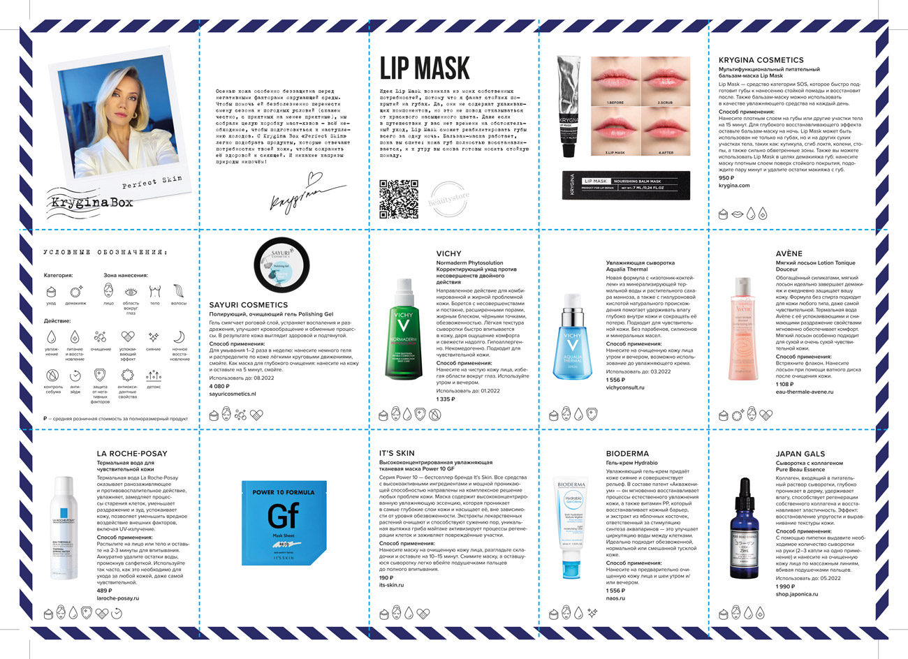
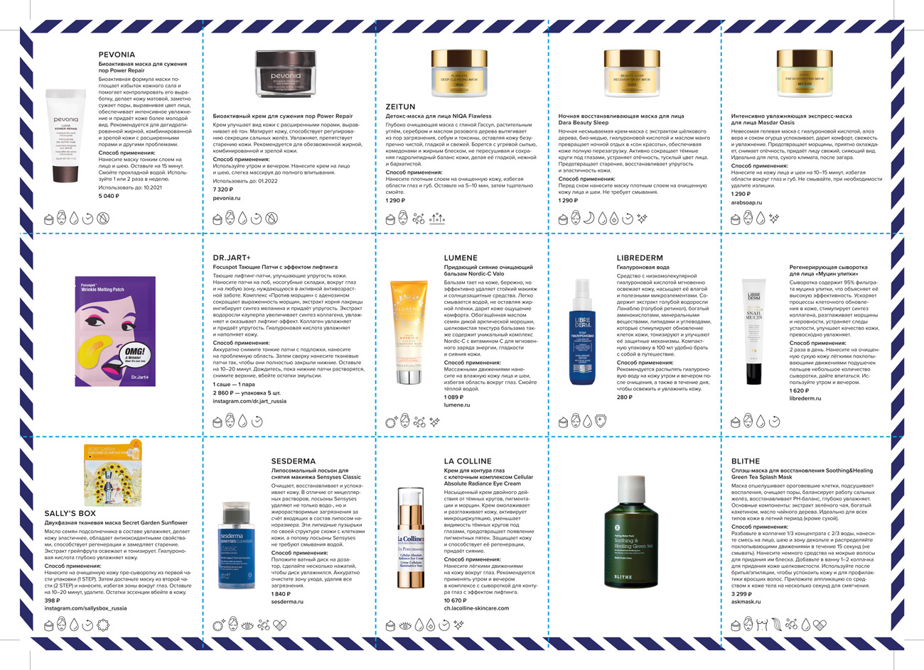
products description card
photos to launch sales in social networks
packaging layout

Art director
Maria Kaner
Maria Kaner
Design
Daria Borzikova
Gvanca Gogitidze
Maria Kaner
Daria Borzikova
Gvanca Gogitidze
Maria Kaner
Photorgaphy
Anastasia Berezhinskaya
Ilya Kaner
Anastasia Berezhinskaya
Ilya Kaner