Krygina Beauty Day
Identity
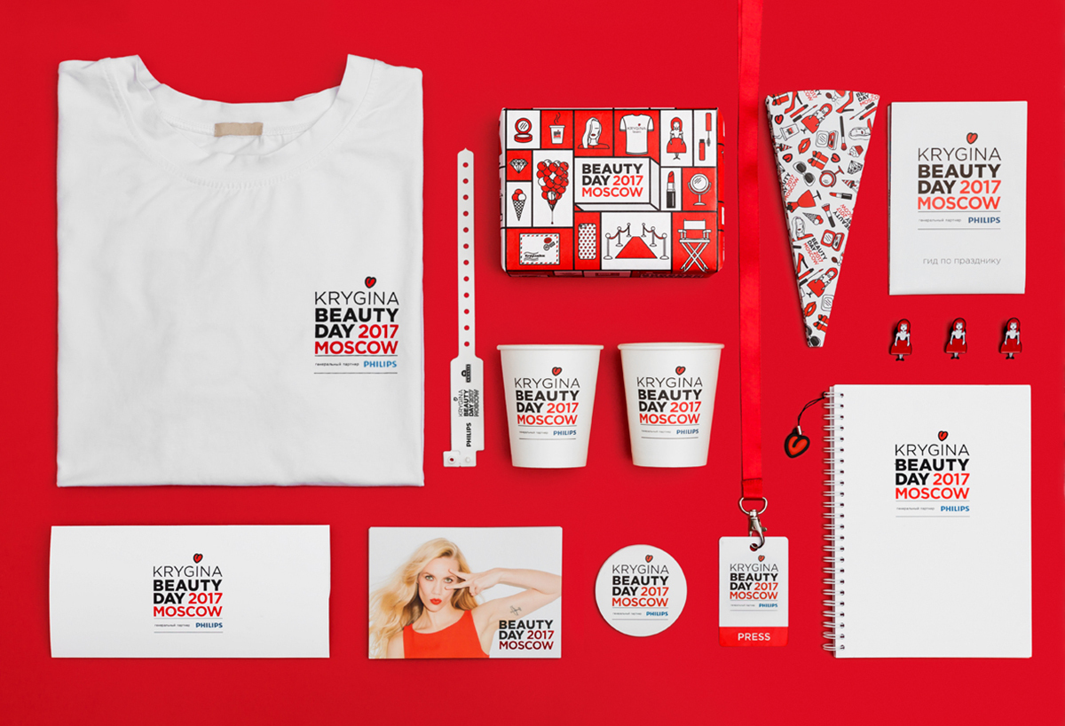
Beauty Day is an annual festival dedicated to the beauty industry that used to held in Moscow for six years. In 2015 I had the opportunity to develop the festival's corporate identity: I developed a logo, color scheme and brand guidelines that ensured consistency across all printed and digital materials. Subsequently, my team and I worked on the development of various printed materials, website content, social media navigation, infographics, photo shoots, and more.
One of the key requirements for the logo was that it had to seamlessly integrated Elena's personal logo, the event's name, and the general sponsor's logo. Given that the sponsors changed every year, it was important to create a flexible and adaptable design that could accommodate different sponsor logos.
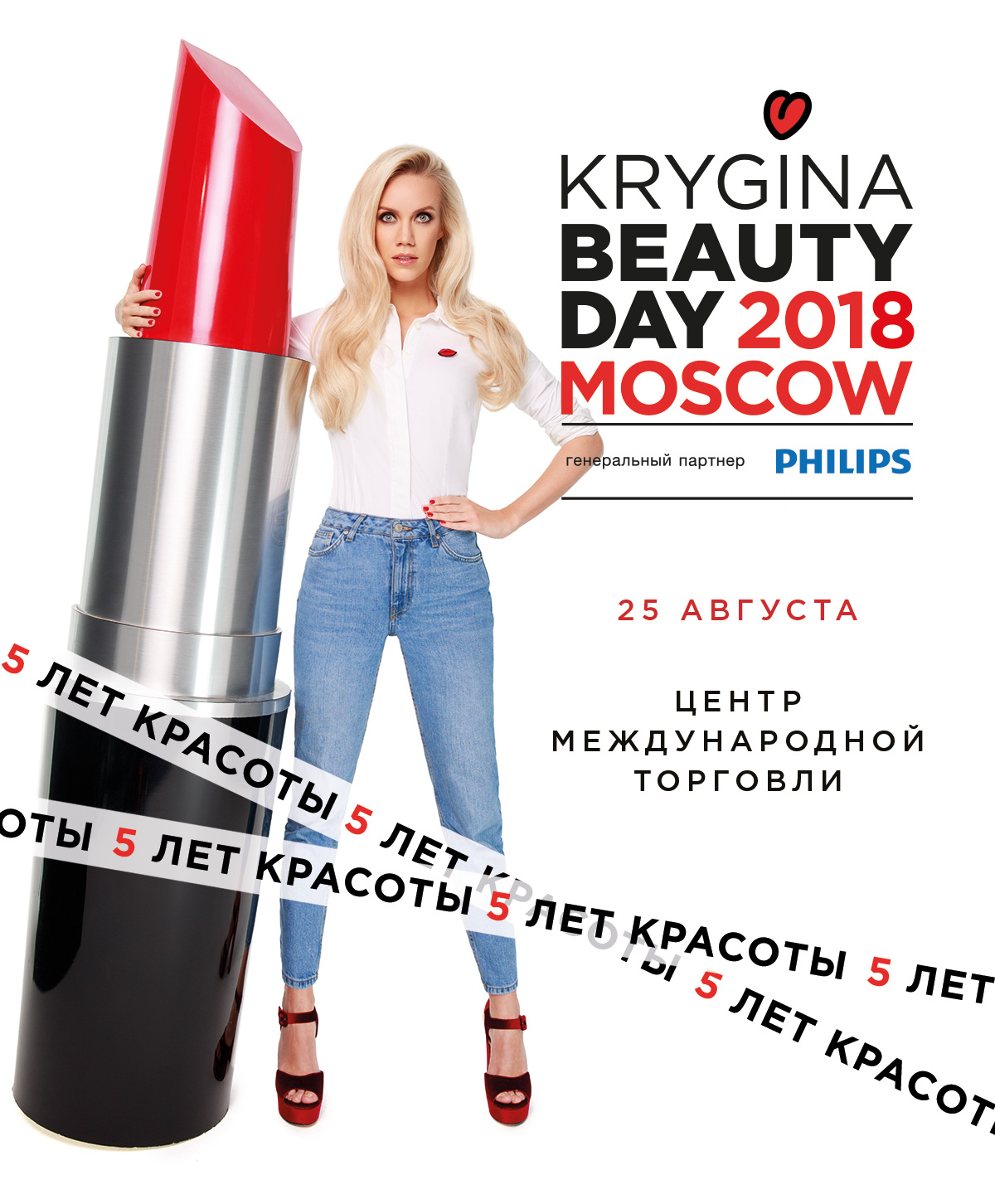
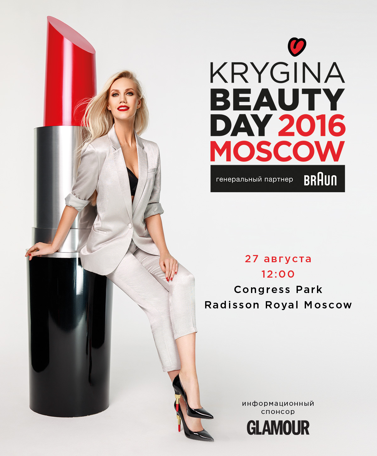
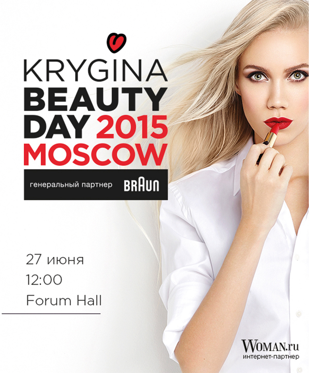
The resulting logo design was versatile and could be used as a whole or separated into individual components, including Elena's logo, a concise logo with the event's name, and the general sponsor's logo. This allowed for various applications across different promotional materials, giving the festival a consistent yet customizable visual presence.
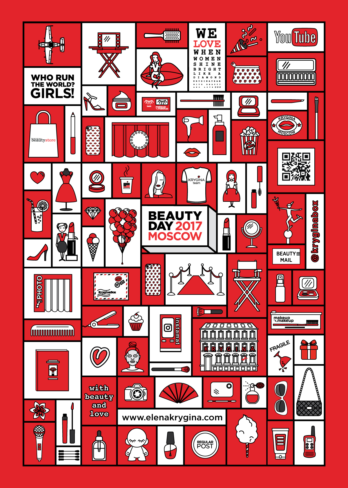
In 2017, I also developed a series of illustrations for Beauty Day, which became an integral part of the festival's identity and were later used as part of Elena and her team's personal brand (known as Kryginateam). The illustrations continue to be used in the production of merch to this day.